Setta 2024
Asset management and governance, with intelligence and dedication.
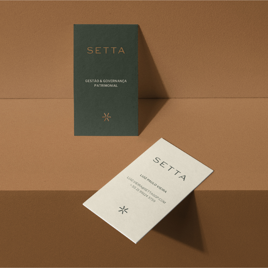
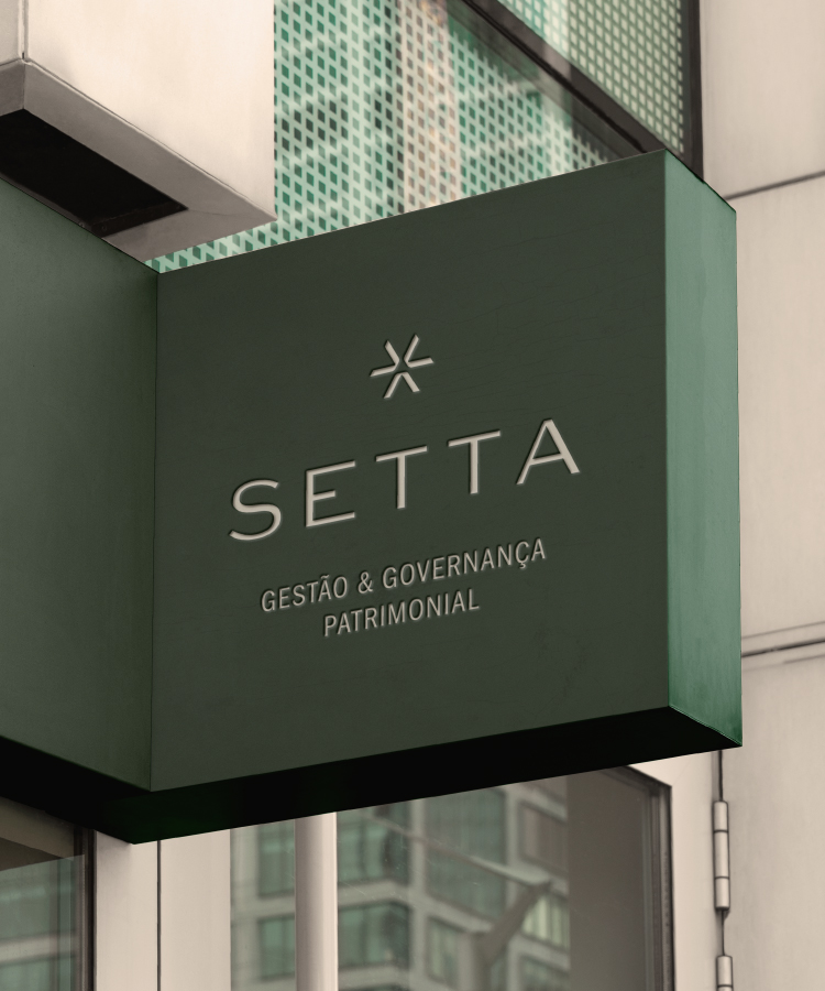
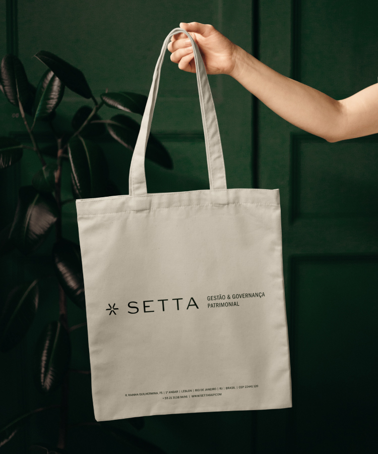
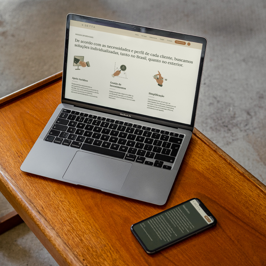
How do you position and communicate a service that has discretion as one of its main pillars, conveying its serene, sophisticated and trustworthy personality? This was our challenge for SETTA, a family office based in Rio de Janeiro.
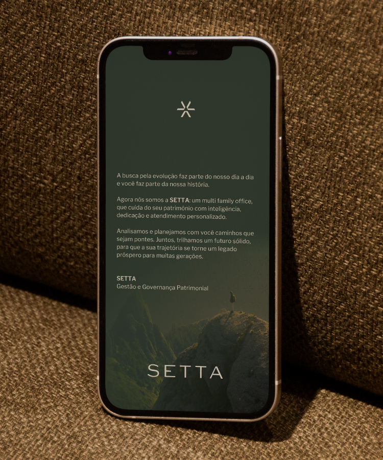
After a corporate reorganization, the company was looking for a new name and visual expression. The project included an immersion with the partners to define positioning, followed by a collaborative naming round, logo development and visual identity.
Services
- Brand strategy
- Naming
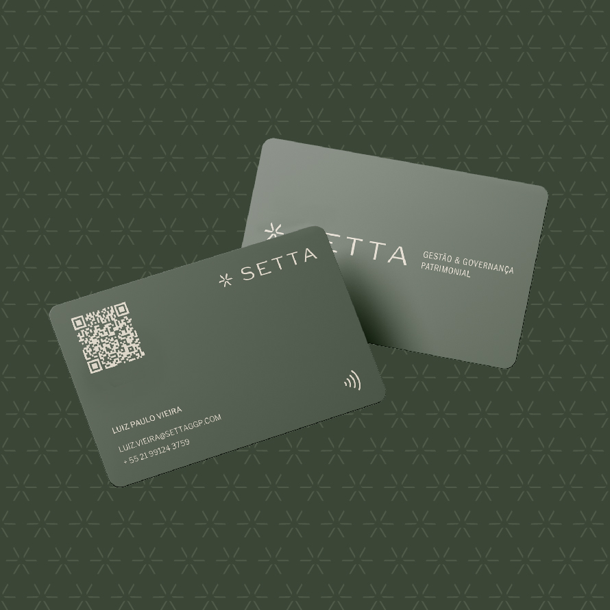
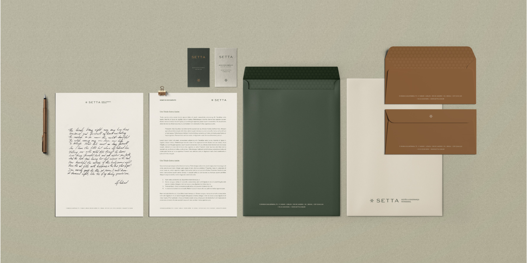
- Visual identity
- Verbal Identity
- Communication Strategy
- UX / UI
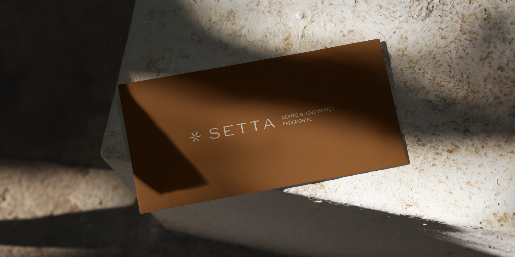
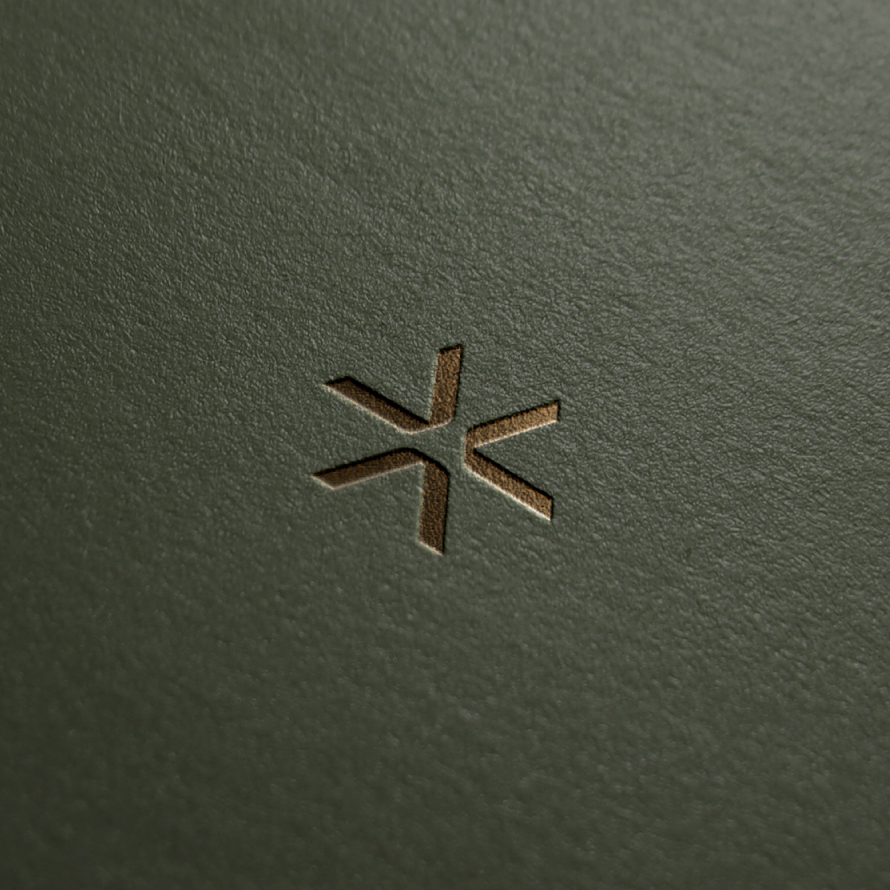
"The symbol that anchors the brand's different signatures came from the idea that the asterisk is, in its purest form, a convergence of arrows.
This point of view was key to visually translating the notions of collaboration, care and security that permeate SETTA's management and underpin the provision of a highly personalized service."
GUSTAVO VIAL, DESIGNER 6D